BUILDER: The Authority Brochure
CHALLENGE: Promote the redesign of BUILDER's magazine, website and newsletters
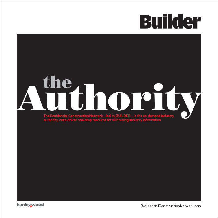
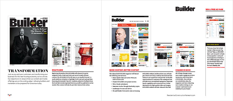
SOLUTION: This square brochure was set up to convey the strength of the brand and feature images of the new layouts and content. I used whitespace and a strong grid to keep the information streamlined and clean.

Brochure Cover
